Data Exploration#
Introduction#
The RMS Titanic disaster offers a tragic but data-rich case study in survival analysis. Let’s explore what patterns emerge from this historical dataset. This notebook focuses on understanding the data structure, identifying missing values, and discovering initial patterns that may predict survival.
Objectives#
Load and profile the dataset
Perform univariate analysis of all features
Explore bivariate relationships with survival
Visualize missing data patterns
Generate initial feature engineering insights
# Standard imports
import pandas as pd
import numpy as np
import matplotlib.pyplot as plt
import seaborn as sns
import warnings
warnings.filterwarnings('ignore')

# Data profiling
from ydata_profiling import ProfileReport

# Missing data visualization
import missingno as msno

# Set visualization style
sns.set_context("notebook", font_scale=1.1)
sns.set_style("whitegrid")
plt.rcParams['figure.figsize'] = (10, 6)
plt.rcParams['figure.dpi'] = 100

# Set random seed for reproducibility
np.random.seed(42)

print("Libraries imported successfully!")
---------------------------------------------------------------------------
ModuleNotFoundError                       Traceback (most recent call last)
Cell In[1], line 10
      6 import warnings
      7 warnings.filterwarnings('ignore')
      8
      9 # Data profiling
---> 10 from ydata_profiling import ProfileReport
     11
     12 # Missing data visualization
     13 import missingno as msno

File /opt/hostedtoolcache/Python/3.11.16/x64/lib/python3.11/site-packages/ydata_profiling/__init__.py:11
      8 import importlib.util  # isort:skip # noqa
      9 from warnings import warn
---> 11 from ydata_profiling.compare_reports import compare  # isort:skip # noqa
     12 from ydata_profiling.controller import pandas_decorator  # isort:skip # noqa
     13 from ydata_profiling.profile_report import ProfileReport  # isort:skip # noqa

File /opt/hostedtoolcache/Python/3.11.16/x64/lib/python3.11/site-packages/ydata_profiling/compare_reports.py:12
     10 from ydata_profiling.model import BaseDescription
     11 from ydata_profiling.model.alerts import Alert
---> 12 from ydata_profiling.profile_report import ProfileReport
     15 def _should_wrap(v1: Any, v2: Any) -> bool:
     16     if isinstance(v1, (list, dict)):

File /opt/hostedtoolcache/Python/3.11.16/x64/lib/python3.11/site-packages/ydata_profiling/profile_report.py:11
      9 with warnings.catch_warnings():
     10     warnings.simplefilter("ignore")
---> 11     import pkg_resources
     13 if not is_pyspark_installed():
     14     from typing import TypeVar

ModuleNotFoundError: No module named 'pkg_resources'
Loading the Data#
Let’s start by loading the Titanic dataset and getting an initial overview of its structure.
# Load the dataset
try:
    raw_data = pd.read_csv('data/titanic.csv')
    print(f"Dataset loaded successfully!")
    print(f"Shape: {raw_data.shape[0]} rows, {raw_data.shape[1]} columns")
except FileNotFoundError:
    print("Error: titanic.csv not found in data/ directory")
    print("Please download the dataset from Kaggle or use the provided data file")
    raw_data = None
# Display first few rows
if raw_data is not None:
    display(raw_data.head())

    # Basic information
    print("\n" + "="*50)
    print("Dataset Info:")
    print("="*50)
    raw_data.info()
Automated Data Profiling#
We’ll use ydata-profiling to generate a comprehensive automated EDA report. This provides a quick overview of distributions, correlations, and missing data patterns.
# Generate automated profile report
# Note: This may take a minute. For faster exploration, we can skip this
# and focus on custom visualizations below

if raw_data is not None:
    # Uncomment to generate full report (saves to HTML)
    # profile = ProfileReport(raw_data, title="Titanic Dataset Profiling")
    # profile.to_file("titanic_profile.html")

    # Quick summary statistics
    print("Summary Statistics:")
    print("="*50)
    display(raw_data.describe())
Missing Data Analysis#
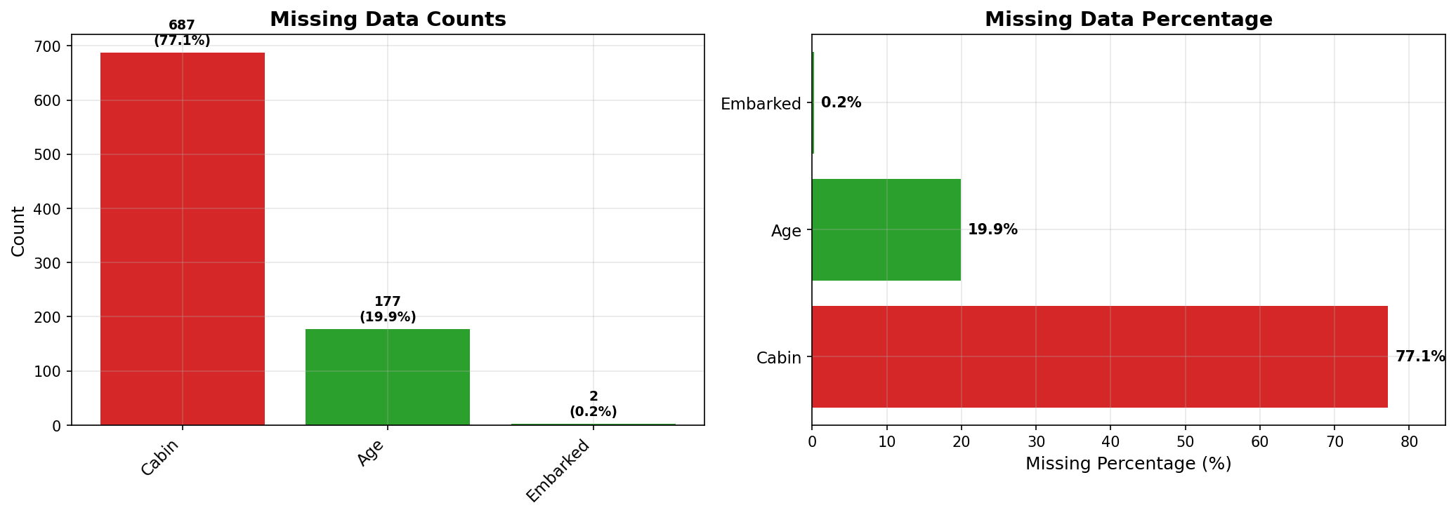
Understanding missing data patterns is crucial for determining appropriate imputation strategies. Let’s visualize and quantify missingness.
if raw_data is not None:
    # Count missing values
    missing_counts = raw_data.isnull().sum()
    missing_pct = (missing_counts / len(raw_data)) * 100

    missing_df = pd.DataFrame({
        'Missing Count': missing_counts,
        'Percentage': missing_pct
    }).sort_values('Missing Count', ascending=False)

    missing_df = missing_df[missing_df['Missing Count'] > 0]

    print("Missing Data Summary:")
    print("="*50)
    display(missing_df)

    # Visualize missing data patterns
    fig, axes = plt.subplots(1, 2, figsize=(14, 5))

    # Matrix plot
    msno.matrix(raw_data, ax=axes[0])
    axes[0].set_title('Missing Data Matrix', fontsize=14, fontweight='bold')

    # Bar plot
    msno.bar(raw_data, ax=axes[1])
    axes[1].set_title('Missing Data Counts', fontsize=14, fontweight='bold')

    plt.tight_layout()
    plt.show()
Univariate Analysis#
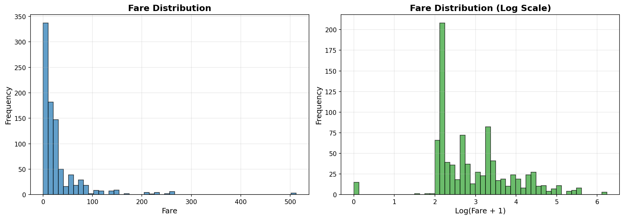
Let’s examine the distribution of each variable individually to understand the data structure.
if raw_data is not None:
    # Continuous variables: Age and Fare
    fig, axes = plt.subplots(2, 2, figsize=(14, 10))

    # Age distribution
    axes[0, 0].hist(raw_data['Age'].dropna(), bins=30, edgecolor='black', alpha=0.7)
    axes[0, 0].set_xlabel('Age (years)')
    axes[0, 0].set_ylabel('Frequency')
    axes[0, 0].set_title('Age Distribution', fontweight='bold')
    axes[0, 0].axvline(raw_data['Age'].median(), color='red', linestyle='--',
                       label=f'Median: {raw_data["Age"].median():.1f}')
    axes[0, 0].legend()

    # Age KDE
    raw_data['Age'].dropna().plot.kde(ax=axes[0, 1])
    axes[0, 1].set_xlabel('Age (years)')
    axes[0, 1].set_ylabel('Density')
    axes[0, 1].set_title('Age Density Plot', fontweight='bold')

    # Fare distribution (log scale due to skewness)
    axes[1, 0].hist(raw_data['Fare'], bins=50, edgecolor='black', alpha=0.7)
    axes[1, 0].set_xlabel('Fare')
    axes[1, 0].set_ylabel('Frequency')
    axes[1, 0].set_title('Fare Distribution', fontweight='bold')

    # Fare log distribution
    axes[1, 1].hist(np.log1p(raw_data['Fare']), bins=50, edgecolor='black', alpha=0.7)
    axes[1, 1].set_xlabel('Log(Fare + 1)')
    axes[1, 1].set_ylabel('Frequency')
    axes[1, 1].set_title('Fare Distribution (Log Scale)', fontweight='bold')

    plt.tight_layout()
    plt.show()
if raw_data is not None:
    # Categorical variables
    fig, axes = plt.subplots(2, 2, figsize=(14, 10))

    # Passenger Class
    pclass_counts = raw_data['Pclass'].value_counts().sort_index()
    axes[0, 0].bar(pclass_counts.index, pclass_counts.values, color=['#1f77b4', '#ff7f0e', '#2ca02c'])
    axes[0, 0].set_xlabel('Passenger Class')
    axes[0, 0].set_ylabel('Count')
    axes[0, 0].set_title('Passenger Class Distribution', fontweight='bold')
    axes[0, 0].set_xticks([1, 2, 3])

    # Sex
    sex_counts = raw_data['Sex'].value_counts()
    axes[0, 1].bar(sex_counts.index, sex_counts.values, color=['#1f77b4', '#ff7f0e'])
    axes[0, 1].set_xlabel('Sex')
    axes[0, 1].set_ylabel('Count')
    axes[0, 1].set_title('Sex Distribution', fontweight='bold')

    # Embarked
    embarked_counts = raw_data['Embarked'].value_counts()
    axes[1, 0].bar(embarked_counts.index, embarked_counts.values,
                   color=['#1f77b4', '#ff7f0e', '#2ca02c'])
    axes[1, 0].set_xlabel('Embarkation Port')
    axes[1, 0].set_ylabel('Count')
    axes[1, 0].set_title('Embarkation Port Distribution', fontweight='bold')

    # Survival (target variable)
    survival_counts = raw_data['Survived'].value_counts()
    axes[1, 1].bar(['Did Not Survive', 'Survived'], survival_counts.values,
                   color=['#d62728', '#2ca02c'])
    axes[1, 1].set_ylabel('Count')
    axes[1, 1].set_title('Survival Distribution', fontweight='bold')
    axes[1, 1].tick_params(axis='x', rotation=45)

    plt.tight_layout()
    plt.show()

    # Print survival rate
    survival_rate = raw_data['Survived'].mean()
    print(f"\nOverall Survival Rate: {survival_rate:.2%}")
Bivariate Analysis: Relationships with Survival#
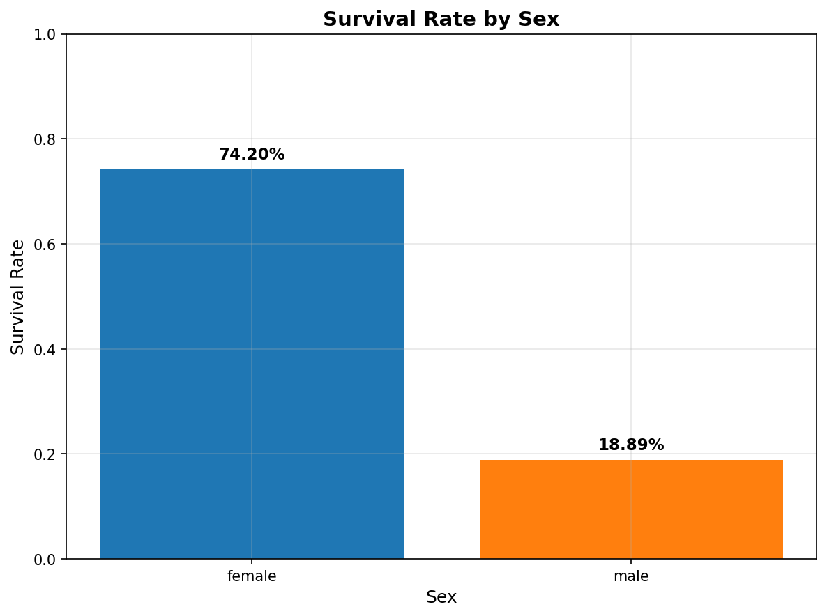
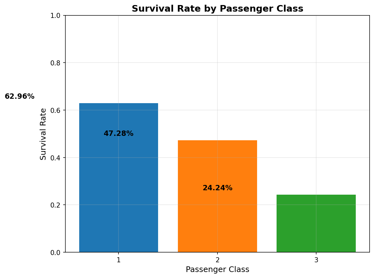
Now let’s explore how different features relate to survival outcomes. This will help identify the strongest predictors.
if raw_data is not None:
    # Survival rates by key categorical variables
    fig, axes = plt.subplots(2, 2, figsize=(14, 10))

    # Survival by Sex
    sex_survival = raw_data.groupby('Sex')['Survived'].agg(['mean', 'count'])
    axes[0, 0].bar(sex_survival.index, sex_survival['mean'], color=['#1f77b4', '#ff7f0e'])
    axes[0, 0].set_ylabel('Survival Rate')
    axes[0, 0].set_title('Survival Rate by Sex', fontweight='bold')
    axes[0, 0].set_ylim([0, 1])
    for i, (idx, row) in enumerate(sex_survival.iterrows()):
        axes[0, 0].text(i, row['mean'] + 0.02, f"{row['mean']:.2%}",
                        ha='center', fontweight='bold')

    # Survival by Passenger Class
    pclass_survival = raw_data.groupby('Pclass')['Survived'].agg(['mean', 'count'])
    axes[0, 1].bar(pclass_survival.index, pclass_survival['mean'],
                   color=['#1f77b4', '#ff7f0e', '#2ca02c'])
    axes[0, 1].set_xlabel('Passenger Class')
    axes[0, 1].set_ylabel('Survival Rate')
    axes[0, 1].set_title('Survival Rate by Passenger Class', fontweight='bold')
    axes[0, 1].set_xticks([1, 2, 3])
    axes[0, 1].set_ylim([0, 1])
    for idx, row in pclass_survival.iterrows():
        axes[0, 1].text(idx, row['mean'] + 0.02, f"{row['mean']:.2%}",
                        ha='center', fontweight='bold')

    # Survival by Embarkation Port
    embarked_survival = raw_data.groupby('Embarked')['Survived'].agg(['mean', 'count'])
    axes[1, 0].bar(embarked_survival.index, embarked_survival['mean'],
                   color=['#1f77b4', '#ff7f0e', '#2ca02c'])
    axes[1, 0].set_xlabel('Embarkation Port')
    axes[1, 0].set_ylabel('Survival Rate')
    axes[1, 0].set_title('Survival Rate by Embarkation Port', fontweight='bold')
    axes[1, 0].set_ylim([0, 1])
    for i, (idx, row) in enumerate(embarked_survival.iterrows()):
        axes[1, 0].text(i, row['mean'] + 0.02, f"{row['mean']:.2%}",
                        ha='center', fontweight='bold')

    # Survival by Family Size (SibSp + Parch)
    raw_data['FamilySize'] = raw_data['SibSp'] + raw_data['Parch'] + 1
    family_survival = raw_data.groupby('FamilySize')['Survived'].agg(['mean', 'count'])
    family_survival = family_survival[family_survival['count'] >= 10]  # Filter small groups
    axes[1, 1].bar(family_survival.index, family_survival['mean'], color='#1f77b4')
    axes[1, 1].set_xlabel('Family Size')
    axes[1, 1].set_ylabel('Survival Rate')
    axes[1, 1].set_title('Survival Rate by Family Size', fontweight='bold')
    axes[1, 1].set_ylim([0, 1])

    plt.tight_layout()
    plt.show()
if raw_data is not None:
    # Age distribution by survival
    fig, axes = plt.subplots(1, 2, figsize=(14, 5))

    # Histogram overlay
    survived_ages = raw_data[raw_data['Survived'] == 1]['Age'].dropna()
    not_survived_ages = raw_data[raw_data['Survived'] == 0]['Age'].dropna()

    axes[0].hist(not_survived_ages, bins=30, alpha=0.6, label='Did Not Survive',
                 color='#d62728', edgecolor='black')
    axes[0].hist(survived_ages, bins=30, alpha=0.6, label='Survived',
                 color='#2ca02c', edgecolor='black')
    axes[0].set_xlabel('Age (years)')
    axes[0].set_ylabel('Frequency')
    axes[0].set_title('Age Distribution by Survival', fontweight='bold')
    axes[0].legend()

    # Box plot
    survival_data = [not_survived_ages, survived_ages]
    axes[1].boxplot(survival_data, labels=['Did Not Survive', 'Survived'])
    axes[1].set_ylabel('Age (years)')
    axes[1].set_title('Age Distribution by Survival (Box Plot)', fontweight='bold')

    plt.tight_layout()
    plt.show()

    # Statistical summary
    print("\nAge Statistics by Survival:")
    print("="*50)
    age_stats = raw_data.groupby('Survived')['Age'].describe()
    display(age_stats)
if raw_data is not None:
    # Fare distribution by survival and class
    fig, axes = plt.subplots(1, 2, figsize=(14, 5))

    # Box plot: Fare by Survival
    survived_fares = raw_data[raw_data['Survived'] == 1]['Fare']
    not_survived_fares = raw_data[raw_data['Survived'] == 0]['Fare']

    axes[0].boxplot([not_survived_fares, survived_fares],
                    labels=['Did Not Survive', 'Survived'])
    axes[0].set_ylabel('Fare')
    axes[0].set_title('Fare Distribution by Survival', fontweight='bold')

    # Box plot: Fare by Class and Survival
    fare_data = []
    labels = []
    for pclass in sorted(raw_data['Pclass'].unique()):
        for survived in [0, 1]:
            subset = raw_data[(raw_data['Pclass'] == pclass) &
                             (raw_data['Survived'] == survived)]['Fare']
            fare_data.append(subset)
            labels.append(f"Class {pclass}\n{'Survived' if survived else 'Not Survived'}")

    axes[1].boxplot(fare_data, labels=labels)
    axes[1].set_ylabel('Fare')
    axes[1].set_title('Fare Distribution by Class and Survival', fontweight='bold')
    axes[1].tick_params(axis='x', rotation=45)

    plt.tight_layout()
    plt.show()
Correlation Analysis#
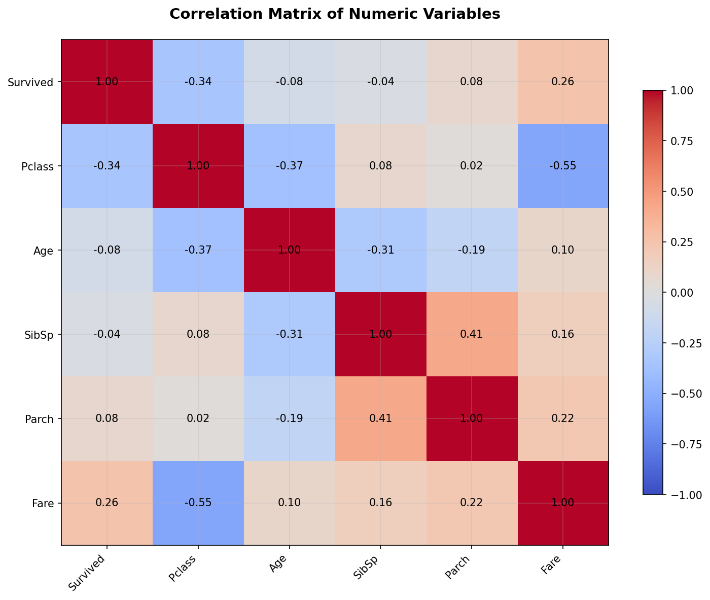
Let’s examine correlations between numeric variables to identify potential multicollinearity and relationships.
if raw_data is not None:
    # Select numeric columns for correlation
    numeric_cols = ['Survived', 'Pclass', 'Age', 'SibSp', 'Parch', 'Fare']
    corr_matrix = raw_data[numeric_cols].corr()

    # Create heatmap
    plt.figure(figsize=(10, 8))
    sns.heatmap(corr_matrix, annot=True, fmt='.2f', cmap='coolwarm', center=0,
                square=True, linewidths=1, cbar_kws={"shrink": 0.8})
    plt.title('Correlation Matrix of Numeric Variables', fontsize=14, fontweight='bold', pad=20)
    plt.tight_layout()
    plt.show()

    # Display correlation with survival
    print("\nCorrelation with Survival:")
    print("="*50)
    survival_corr = corr_matrix['Survived'].sort_values(ascending=False)
    display(survival_corr)
Feature Engineering Insights#
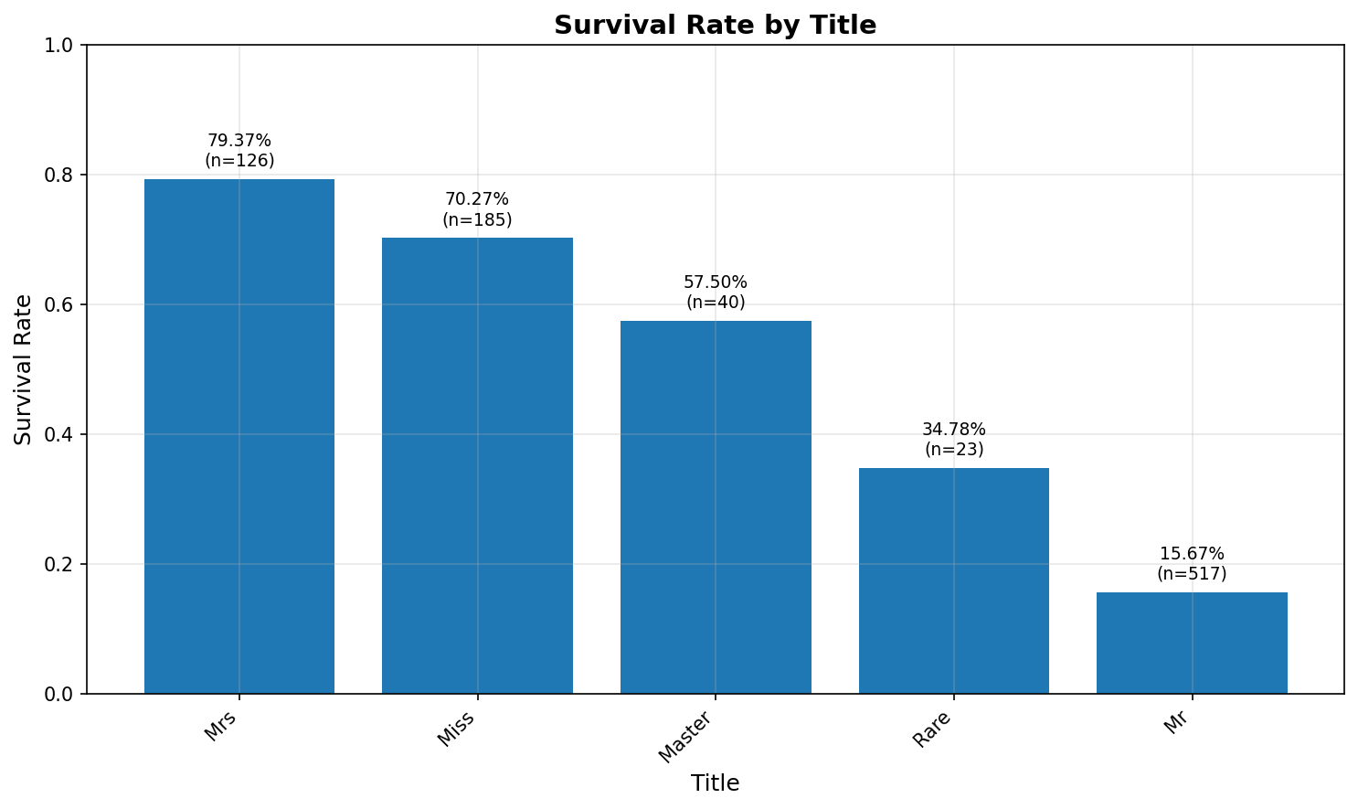
Let’s extract some initial features that might be predictive, such as titles from names and family size.
if raw_data is not None:
    # Extract title from name
    raw_data['Title'] = raw_data['Name'].str.extract(' ([A-Za-z]+)\.', expand=False)

    # Consolidate rare titles
    title_mapping = {
        'Mr': 'Mr',
        'Miss': 'Miss',
        'Mrs': 'Mrs',
        'Master': 'Master',
        'Dr': 'Rare',
        'Rev': 'Rare',
        'Col': 'Rare',
        'Major': 'Rare',
        'Mlle': 'Miss',
        'Countess': 'Rare',
        'Ms': 'Miss',
        'Lady': 'Rare',
        'Jonkheer': 'Rare',
        'Don': 'Rare',
        'Dona': 'Rare',
        'Mme': 'Mrs',
        'Capt': 'Rare',
        'Sir': 'Rare'
    }
    raw_data['Title'] = raw_data['Title'].map(title_mapping)
    raw_data['Title'] = raw_data['Title'].fillna('Rare')

    # Visualize survival by title
    title_survival = raw_data.groupby('Title')['Survived'].agg(['mean', 'count']).sort_values('mean', ascending=False)

    fig, ax = plt.subplots(figsize=(10, 6))
    bars = ax.bar(title_survival.index, title_survival['mean'], color='#1f77b4')
    ax.set_ylabel('Survival Rate')
    ax.set_xlabel('Title')
    ax.set_title('Survival Rate by Title', fontweight='bold')
    ax.set_ylim([0, 1])

    # Add count labels
    for i, (idx, row) in enumerate(title_survival.iterrows()):
        ax.text(i, row['mean'] + 0.02, f"{row['mean']:.2%}\n(n={int(row['count'])})",
                ha='center', fontsize=9)

    plt.xticks(rotation=45, ha='right')
    plt.tight_layout()
    plt.show()

    print("\nTitle Distribution:")
    print("="*50)
    display(title_survival)
Key Takeaways#
Data Quality#
Missing Data: Age has ~20% missing values, Cabin has ~77% missing, Embarked has only 2 missing
Data Types: Mix of numeric and categorical variables requiring appropriate encoding
Initial Patterns#
Sex: Strong predictor - women had much higher survival rates (~74% vs ~19% for men)
Passenger Class: Clear gradient - 1st class (63%) > 2nd class (47%) > 3rd class (24%)
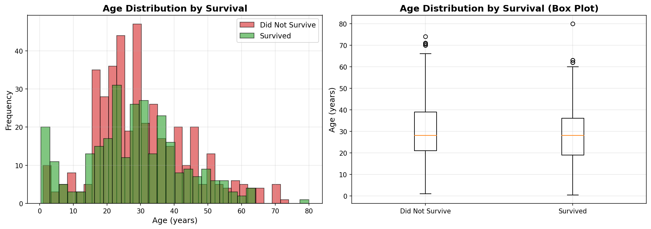
Age: Children (especially < 10) had higher survival rates
Family Size: Moderate effect - very small and very large families had lower survival
Next Steps#
Handle missing Age values using imputation (considering Pclass and Title)
Decide on Cabin treatment (high missingness suggests dropping or creating binary feature)
Encode categorical variables appropriately
Create interaction features (e.g., Sex × Pclass)
Normalize/standardize features for distance-based algorithms